Home • Programming • CSS
Quick start Bootstrap
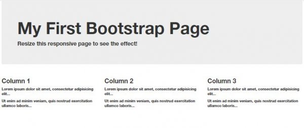
 Copy and paste the following code to your html document and view it with any web browser.
<!DOCTYPE html>
<html lang="en">
<head>
  <title>Bootstrap Example</title>
  <meta charset="utf-8">
  <meta name="viewport" content="width=device-width, initial-scale=1">
  <link rel="stylesheet" href="http://maxcdn.bootstrapcdn.com/bootstrap/3.3.4/css/bootstrap.min.css">
  <script src="https://ajax.googleapis.com/ajax/libs/jquery/1.11.1/jquery.min.js"></script>
  <script src="http://maxcdn.bootstrapcdn.com/bootstrap/3.3.4/js/bootstrap.min.js"></script>
</head>
<body>

<div class="container">
  <div class="jumbotron">
    <h1>My First Bootstrap Page</h1>
    <p>Resize this responsive page to see the effect!</p>
  </div>
  <div class="row">
    <div class="col-sm-4">
      <h3>Column 1</h3>
      <p>Lorem ipsum dolor sit amet, consectetur adipisicing elit...</p>
      <p>Ut enim ad minim veniam, quis nostrud exercitation ullamco laboris...</p>
    </div>
    <div class="col-sm-4">
      <h3>Column 2</h3>
      <p>Lorem ipsum dolor sit amet, consectetur adipisicing elit...</p>
      <p>Ut enim ad minim veniam, quis nostrud exercitation ullamco laboris...</p>
    </div>
    <div class="col-sm-4">
      <h3>Column 3</h3>
      <p>Lorem ipsum dolor sit amet, consectetur adipisicing elit...</p>
      <p>Ut enim ad minim veniam, quis nostrud exercitation ullamco laboris...</p>
    </div>
  </div>
</div>

</body>
</html>
Bootstrap Grid System
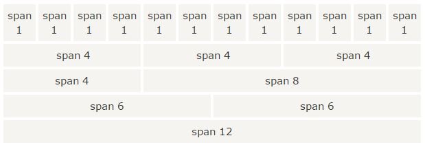
Bootstrap's grid system allows up to 12 columns across the page. If you do not want to use all 12 column individually, you can group the columns together to create wider columns: Bootstrap' grid system is responsive, and the columns will re-arrange depending on the screen size: On a big screen it might look better with the content organized in three columns, but on a small screen it would be better if the content items where stacked on top of each other.
Grid Classes
The Bootstrap grid system has four classes: xs (for phones) sm (for tablets) md (for desktops) lg (for larger desktops) The classes above can be combined to create more dynamic and flexible layouts.Grid System Rules
Some Bootstrap grid system rules: 1. Rows must be placed within a .container (fixed-width) or .container-fluid (full-width) for proper alignment and padding 2. Use rows to create horizontal groups of columns 3. Content should be placed within columns, and only columns may be immediate children of rows 4. Predefined classes like .row and .col-sm-4 are available for quickly making grid layouts 5. Columns create gutters (gaps between column content) via padding. That padding is offset in rows for the first and last column via negative margin on .rows 6. Grid columns are created by specifying the number of 12 available columns you wish to span. For example, three equal columns would use three .col-sm-4Basic Structure of a Bootstrap Grid
The following is a basic structure of a Bootstrap grid:
<div class="container">
  <div class="row">
    <div class="col-*-*"></div>
  </div>
  <div class="row">
    <div class="col-*-*"></div>
    <div class="col-*-*"></div>
    <div class="col-*-*"></div>
  </div>
  <div class="row">
    ...
  </div>
</div>
So, to create the layout you want, create a container (<div class="container">). Next, create a row (<div class="row">). Then, add the desired number of columns (tags with appropriate .col-*-* classes). Note that numbers in .col-*-* should always add up to 12 for each row.
Creating a Jumbotron
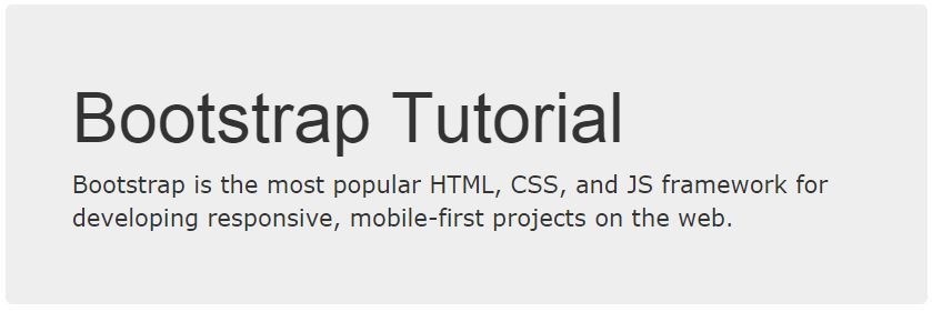
 A jumbotron indicates a big box for calling extra attention to some special content or information.
A jumbotron is displayed as a grey box with rounded corners. It also enlarges the font sizes of the text inside it.
Tip: Inside a jumbotron you can put nearly any valid HTML, including other Bootstrap elements/classes.
Use a <div> element with class .jumbotron to create a jumbotron:
Jumbotron Inside Container
Place the jumbotron inside the <div class="container"> if you want the jumbotron to NOT extend to the edge of the screen:
<div class="container">
  <div class="jumbotron">
    <h1>Bootstrap Tutorial</h1>
    <p>Bootstrap is the most popular HTML, CSS, and JS framework for developing
    responsive, mobile-first projects on the web.</p>
  </div>
  <p>This is some text.</p>
  <p>This is another text.</p>
</div>
Jumbotron Outside Container
Place the jumbotron outside the <div class="container"> if you want the jumbotron to extend to the screen edges:<div class="jumbotron"> <h1>Bootstrap Tutorial</h1> <p>Bootstrap is the most popular HTML, CSS, and JS framework for developing responsive, mobile-first projects on the web.</p> </div> <div class="container"> <p>This is some text.</p> <p>This is another text.</p> </div>
Creating a Page Header
A page header is like a section divider. The .page-header class adds a horizontal line under the heading (+ adds some extra space around the element): Use a <div> element with class .page-header to create a page header:<div class="page-header"> <h1>Example Page Header</h1> </div>
Downloading Bootstrap
If you want to download and host Bootstrap yourself, go to http://getbootstrap.com , and follow the instructions there.Bootstrap CDN
If you don't want to download and host Bootstrap yourself, you can include it from a CDN (Content Delivery Network). MaxCDN provide CDN support for Bootstrap's CSS and JavaScript. Also include jQuery:<!-- Latest compiled and minified CSS --> <link rel="stylesheet" href="http://maxcdn.bootstrapcdn.com/bootstrap/3.3.4/css/bootstrap.min.css"> <!-- jQuery library --> <script src="https://ajax.googleapis.com/ajax/libs/jquery/1.11.1/jquery.min.js"></script> <!-- Latest compiled JavaScript --> <script src="http://maxcdn.bootstrapcdn.com/bootstrap/3.3.4/js/bootstrap.min.js"></script>One advantage of using the Bootstrap CDN: Many users already have downloaded Bootstrap from MaxCDN when visiting another site. As a result, it will be loaded from cache when they visit your site, which leads to faster loading time. Also, most CDN's will make sure that once a user requests a file from it, it will be served from the server closest to them, which also leads to faster loading time.
Bootstrap Header
1. Add the HTML5 doctype Bootstrap uses HTML elements and CSS properties that require the HTML5 doctype. Always include the HTML5 doctype at the beginning of the page, along with the lang attribute and the correct character set:
<!DOCTYPE html>
<html lang="en">
  <head>
    <meta charset="utf-8">
  </head>
</html>
2. Bootstrap 3 is mobile-first
Bootstrap 3 is designed to be responsive to mobile devices. Mobile-first styles are part of the core framework.
To ensure proper rendering and touch zooming, add the following <meta> tag inside the <head> element:
<meta name="viewport" content="width=device-width, initial-scale=1">The width=device-width part sets the width of the page to follow the screen-width of the device (which will vary depending on the device). The initial-scale=1 part sets the initial zoom level when the page is first loaded by the browser. 3. Containers Bootstrap also requires a containing element to wrap site contents. There are two container classes to choose from: 1. The .container class provides a responsive fixed width container 2. The .container-fluid class provides a full width container, spanning the entire width of the viewport Note:Containers are not nestable (you cannot put a container inside another container).
Share
- University
- Online Tips
- Engineering
- Programming
- General Subjects
- Science
- News
- Jobs
- Commerce
- General Knowledge
- Story, Tales & Poem
- Software Application
- Framework
- Operating System
- Database
- Networking
- Quiz

Comments 0